1. The assignment that I liked working on the best was the color wheel and the scale. It was really fun to be able to use paint to create the wheel and learn about the different colors that actually make the "primary" colors. I liked that it was very hands on and we could create it in whatever design we wanted. The color scale was difficult to make because it goes from black to white, but it was a fun challenge.
2. The assignment that I like the least was the mask making, and the self-portrait, and the hand drawing. The mask making felt completely out of my element and I had a very hard time deciding what to use to make it. The self-portrait was just hard. I don't know how to draw so it was difficult to be able to look at a picture of yourself and draw it, my picture and drawing looked completely different. The drawings of the hands assignment was near impossible, I had no idea how to draw the hands, and they looked terrible haha!, but hey, i'm not an artist. I tried my best on them all.
3. I really liked using Angel. I loved that our grades were updated regularly I've had many teachers that use angel but don't update grades.
4. If I was able to change the course I would keep all of the art making assignments. I might add a few more simple drawing ones to build up to have us draw our self-portraits. I would delete a few of the video reviews, I felt that after a while they became repetitive when we described how they related to the text. I think I would add a few more painting assignments too, or another photography assignment, just because I realized how much I loved them.
5. I would defiantly recommend this course to my peers. It was an awesome way for me to be able to get my art credit out of the way. I have been waiting for quite a few semesters to get into this class and I'm very happy that I did!
6. The only other thing I have to add to this was, at times it seemed like it was more of a upper 300 level class. For being a 200 level class there was a lot of work, and at times I was scared I wouldn't be able to keep up. Maybe it was because I was taking 18 credits this semester, but sometimes I was overwhelmed, regardless I got through it and would take this class again in a heart beat.
Wednesday, May 15, 2013
Reflection of AED
1. My expectations for taking this course was to learn a lot about art. I really think that I did, reading the text book every week seemed to give me a tour through the world of art development. I learned everything from the different art movements, to the different forms and medias of art. I wanted to learn about art history, and I learned quite a bit about that subject as well.
2. After taking this class I would say art is a diverse range of expression. In my first post I didn't know how to describe art and now wherever I look all I see is art.
3. I didn't have a favorite artist in my first post, and I don't think that I do now either. I really like van Goghs work, the way he is so abstract is amazing, and at the same time his art works always look complete. I also really like Andy Warhol's art, its very unique and different, I love the pop of colors everywhere and the play on the original pieces that he does. I also really like Kelly Richardson, I had never heard of her until the art gallery visit, I found myself in her exhibit for a couple hours, it was very interesting.
4. I really liked taking an online course, it was a good experience, I liked that I could get the work done on my time. I was right in my first blog, keeping up with the work is going to be the most important part, luckily because of due dates I had no choice but to keep up with the work.
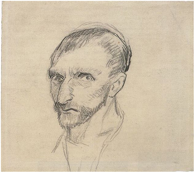
Self-Portrait, Module 15
Inspiration:

Andy Warhol
1966.
Silkscreen ink on synthetic polymer paint on nine canvases
Each canvas 22 1/2 x 22 1/2", overall 67 5/8 x 67 5/8"
The Museum of Modern Art
Vincent van Gogh
1886
Pencil on paper
Van Gog Museum

Dante Gabriel Rossetti
1847
Pencil and pastel on paper
197 mm x 178 mm
National Portrait Gallery
Me:


Questions:
1.
I selected these inspiration pieces because I knew I was going to be using pencil so I wanted to see art professional sketches in pencil. I added the Warhol portrait because it's fun and I really like the pop art movement, I tried to incorporate that by using sunglasses.
2.
I selected pencil and paper because I knew I wouldn't be good at this assignment. I knew I would make a lot of mistakes so I wanted to be able to easily starts over or erase something. I'm not a professional so I needed all the help I could get.
3.
The whole drawing was a challenge to me. Especially the mouth and nose, I tried to use a picture of me without sunglasses but I struggled even worse with the placement with the nose.I knew that if I used sunglasses it would create a place for my nose. I also just took the picture step by step and focus on one part of the piece at a time.
4.
This image represents me because it is me, I wear sunglasses almost everyday, I hate leaving my house without them. Including them was just like including an accessory to myself. I tried my best to make it look as best like me as I could get it.
5.
I used shading in my picture a lot. I had shading in my hair, nose, and sunglasses. It added a little extra to my drawing. I also used lines, although I erased them to keep my sunglasses and mouths equal I drew straight lines across my face to keep it symmetrical and proportional. I used proportion when I made my mouth, nose and sunglasses, I wanted to keep them as try to size as I could.
6.
I enjoyed creating this image, it was a lot easier than I thought it was going to be. I really struggled with the creation of my mouth and teeth. I also avoided having to draw my eyes by using sunglasses. I knew I would have struggled with that part as well.
7.
I think my final picture turned out okay, it certainly looks different than the picture of myself, but I did my best to draw myself.
Andy Warhol
1966.
Silkscreen ink on synthetic polymer paint on nine canvases
Each canvas 22 1/2 x 22 1/2", overall 67 5/8 x 67 5/8"
The Museum of Modern Art
Vincent van Gogh
1886
Pencil on paper
Van Gog Museum
Dante Gabriel Rossetti
1847
Pencil and pastel on paper
197 mm x 178 mm
National Portrait Gallery
Me:


Questions:
1.
I selected these inspiration pieces because I knew I was going to be using pencil so I wanted to see art professional sketches in pencil. I added the Warhol portrait because it's fun and I really like the pop art movement, I tried to incorporate that by using sunglasses.
2.
I selected pencil and paper because I knew I wouldn't be good at this assignment. I knew I would make a lot of mistakes so I wanted to be able to easily starts over or erase something. I'm not a professional so I needed all the help I could get.
3.
The whole drawing was a challenge to me. Especially the mouth and nose, I tried to use a picture of me without sunglasses but I struggled even worse with the placement with the nose.I knew that if I used sunglasses it would create a place for my nose. I also just took the picture step by step and focus on one part of the piece at a time.
4.
This image represents me because it is me, I wear sunglasses almost everyday, I hate leaving my house without them. Including them was just like including an accessory to myself. I tried my best to make it look as best like me as I could get it.
5.
I used shading in my picture a lot. I had shading in my hair, nose, and sunglasses. It added a little extra to my drawing. I also used lines, although I erased them to keep my sunglasses and mouths equal I drew straight lines across my face to keep it symmetrical and proportional. I used proportion when I made my mouth, nose and sunglasses, I wanted to keep them as try to size as I could.
6.
I enjoyed creating this image, it was a lot easier than I thought it was going to be. I really struggled with the creation of my mouth and teeth. I also avoided having to draw my eyes by using sunglasses. I knew I would have struggled with that part as well.
7.
I think my final picture turned out okay, it certainly looks different than the picture of myself, but I did my best to draw myself.
Tuesday, May 14, 2013
Project 4, Exhibit Review
1.
The project that I reviewed was Stephanie Aendas's exhibit A Dog's Eye View.
2.
I selected to review this exhibit because I am an animal lover. I have a dog of my own so I knew I would really enjoy reviewing this exhibit. I know that when reviewing an exhibit you need to try to stay unbias, which I thought would be a fun challenge for myself. I could have easily just said I loved it and be done.
3.
I really struggled with finding something wrong with the exhibit. I liked all of the works of art that she used in her exhibit. Since I love dogs it was hard for me to say anything bad about them, which I didn't do. I just focused on suggesting different arrangement of the deletion of a certain piece rather than critiquing the animals.
4.
I didn't mind critiquing my peers work. I think it is easier to critique someones work that you don't know personally. Also knowing that they're my peers and they have to do the same thing as me made it easier to review their work.
5.
Yes, I would love to read what my peers had to say about my exhibit. I really enjoyed putting mine together so it'd be interesting to see if they felt the same as I did on my exhibit.
6.
I would rate my article a 8, since it was my first ever article review I wasn't sure how to balance out the sections of the review. I focused a lot of the analyzing of the exhibit and the breaking down of the exhibit and the art work, and not so much on the emotional aspect. I think it was good for my first time!
7.
Yes, I enjoyed working on this project. It was fun to get all of the different art works and arrange them so that they fit well together.
Saturday, May 11, 2013
Review, Project 4
For this project I chose to use the theme of storms. I have always been fascinated by storms, and I knew if i used that theme for my exhibit I could add photography (my favorite form of art). I began researching famous artworks about storms and I came up with many. Most of them were rain storms, but I was lucky to find some snow storms. I chose to use photography for the emphasis of snow storms, and tornadoes. I don't think any painting could look as good a photo of a tornado. I designed my power point so that if it were a real exhibit it would be in stages. First, the stormy artworks that were landscapes, then the sea storms, then snow storms, and lastly a storm chasing photo. I put a lot of thought into how to arrange the order, it ended up being in seasonal order as well. Starting with summer storms and ending with spring storms with fall and winter in between. I wanted to use pieces of art that had a lot of color and contrasting of colors to create the storm clouds, when using the theme of storms it wasn't hard to find the color contrasting.
Overall, I think that my power point and exhibition worked out well. I made sure that when I was explaining the pieces of art I wasn't offensive to the artists, I was critiquing and reviewing the art and not the artists!
Overall, I think that my power point and exhibition worked out well. I made sure that when I was explaining the pieces of art I wasn't offensive to the artists, I was critiquing and reviewing the art and not the artists!
Friday, May 10, 2013
Video Review, Module 15
1. Key Concepts
Greenberg on Art Criticism: An Interview by T. J. Clark
-critiquing visual art is harder than critiquing music and literature
-you don't ask anything of art but to be good
-there has been a main stream all along
-doesn't want to prescribe art
-when talking about art, all you should discuss is the art
-everything in you has to be in your eye or ear to be in your art
-when arts good its everything it should be
-experience = good art
The Colonial Encounter: Views of Non-Western Art and Culture
-1900 Paris Worlds Fair ran for 8 months with 15 million visitors
-colonial section exposed the nationalism of the event
-different exhibits have different things symbolized and displayed so people understand the connection to the times
2.
Yes, these videos relate to the art criticism project. When watching the videos I learned that it's important for me to critique the art and not the artists. My personal biases cannot be added into the critiquing either. Also, when viewing the exhibits you need to make sure that you understand what they are portraying and the point they are trying to make.
3.
The films were very interesting. The videos gave a lot of insight on how to view exhibits, and also how to review them. I need to make sure that I am only reviewing the art, and not the artists.
Friday, May 3, 2013
Module 13,14 Video Review
1. Key Concepts:
The Lowdown on Lowbrow
- a person regarded as uncultivated and lacking in taste
-originated in 1979
-lowbrow is unique to every artist
-defined differently by each artist
-social scene with a common love/experience
-high influenced by pop art
Displaying Modern Art:
-in 2000 museum opened and had over 1 million guests within 47 days
-MOMA opened in 1939
-history is represented by the centuries through the art
-art is displayed in 4 sections, by themes -lanscape, still life, history, nude
-wanted to convey emotion
-rooms are very different
-felt that art should be more than entertainment
Bones of Contention:
-over past 150 years bones of Native Americans have been collected
-Native Americans want their ancestors back
-constant battle about whether or not the Native American bones need to be returned
-many of the states passed laws allowing them their bones back
-archaeology is relating to art
-California was making archaeology hard to stick with
-Smithsonian held more than 18,000 bones of Native Americans
-Bones were returned and the graves were protected
An Acquiring Mind:
-1963 he brought his background of European painting as assistant at the Met
-became director in 1977
-1870 opened with 144 European art works
-he gained more than 84,000 piece of art
-selected painting off of color range per room
-lots of questioning goes into acquiring art
-knowledge makes the museum work
-doesn't make the decision to collect art by himself
-the exhibitions are why the museums are so popular
-you make the museums for the guests, want them to be happy and to continue coming back
2. Yes, the videos relate to my exhibition. Landscapes were mentioned in a few of the videos, and since i'm doing weather landscape and nature play a big role.
3. These videos were very helpful. They explained why it is so important to think about what you are going to add to your exhibit, and how to choose what to add. The last video was the most helpful, hearing from a director of the museum was very helpful!
Saturday, April 27, 2013
Module 12, Video Review
1. I chose the two videos Abstract Expressionism and Pop: Art of the '50s and '60s and Andy Warhol : Images of an Image because they seemed very interesting to me. I really like pop art and I knew that's what Andy Warhol did, so that was an easy pick for me. I also knew he made the campbell's soup painting so I was interested in learning more about him. As I stated I really enjoy pop art so I figured the abstract expressionism art of the '50s and '60s would be very interesting. I knew a little about that type of art, but I was interested in learning more.
2. Key Concepts-
Abstract Expressionism and Pop Art of the '50s and '60s:
-the more they focused on their pictures, the more detail that they could add
-the looking at the color makes us think we see that the colors take on different shapes
-Pollock let the paint drip and drop off the brush onto the canvas
-all the painters strength is shown in bringing the paint to the canvas/cotton cloth (Frankenthaler)
-using the cotton cloth soaked up the paint and created different pictures
-Flag became a symbol in the art world as it does symbolize America
-Warhol started the repetition with stamps
-always used the same starting portrait for the art using the repetition
Andy Warhol: Images of an Image:
- He wanted to be a tap dancer and not an artist
- Worked commercially in magazines, stayed out of museums and wasn't known for a very long time
- Connected photos of people all his life
- After Marilyn death he chose one image and using the silk screen technique switched it up
- To silk screen pictures need to be blown up a lot
- If anything happens to the screen- the images are ruined
- Obsessed with the idea of celebrity
- Published his own magazine
- Did a movie with Liz Taylor- became an international superstar
- Sometimes used Polaroid pictures as the base of his artwork
- Produced dozens of self-portraits
3. These videos relate to the text because in chapter 22 we learned about the different art styles that were happening in the '50s and '60s. We read in chapter 22 about Pollock and Warhol who were all spoken about in the videos.
4. I didn't mind the Andy Warhol video, but the Abstract Expressionism video was very dry. I liked that the Warhol video started with music and an interview of him. The abstract video was about the creation of abstract and it talked a little bit about pop art, but the Warhol video went more in depth with the pop art. They add depth to the text because they go into detail about what we read. They add more information to what we had already read. Using the videos gave us the ability to view the artist's work while we were learning about them and their style of art rather than just reading about it on the author pages in the chapter.
Sunday, April 21, 2013
Art Gallery, Visit 2
Step 1: The Exhibition
Questions about the exhibit:
1. What is the title of the exhibit?
1. What is the title of the exhibit?
- The title of the exhibit was "Kelly Richardson: Legion"
2. What is the theme of the exhibition?
- The theme of the exhibition was all about nature. The artist created videos with sounds to express her thoughts on nature and human interaction.
Step 2: The Gallery
Questions about the physical space:1. What type of lighting is used?
- The rooms in which the exhibits were located were almost completely black, there was a little light in the corner of each room for the information card to be displayed. There was some lighting thrown of by the projectors, but not much.
- The walls appeared to be either black or a really really dark navy. I couldn't tell the difference, I believe they were black because the room had very little light. However, one of the rooms had a white tiled floor.
- The walls at the entrance of the exhibit were rock. The entrance had a very Greek feel to it, with many columns in the open space outside the exhibit. The exhibit itself was very dark, all of the exhibits were connected creating a tunnel of darkness.
4. How is the movement of the viewer through the gallery space?
- The movement was very good. There was a lot of space in each room so you could get as close to the screen as you wanted, or you could stand from a distance, you could even view one screen from another room. The halls were open so it made movement from one screen to the next easy.
Step 3: The Artwork
Questions about the artwork:
1. How are the artworks organized?
- The artworks were very neatly organized. Each screen had it's own room, and they rooms were connected so that you could move right from one to the next.
- The artworks were similar because they all had the same themes. Each piece was about nature and human involvement to some aspect. They were also all video installations with sound, which sometimes made them seem repetitive.
3. How are the artworks different?
- The artworks were different because they each had a different underlying message. Some were about animal cruelty, and others were about the destruction of nature.
4. How are the artworks framed?
- The artworks weren't framed. They were projected onto screens.
5. How are the artworks identified and labeled?
- The artworks were identified and labeled in each corner of the room. There was a white informational card mounted onto the wall explaining all of the information about the artwork of that room.
6. What is the proximity of the artwork to each other?
1. In this video (Mariner 9) I see what appears to be another planet.
2. Pattern, proportion, and texture are all used in this video. The land is repeating the same look using pattern. The objects on the "planet" are proportioned perfectly to the sizing of all the land and it's surroundings. Texture is used to display the bumpy and uneven ground.
3. I believe that this is symbolizing what could happen to our planet if we keep treating it the way we have been.
4. I believe that the author is trying to tell us that our world, what we live on can easily look like this if it's bring destroyed the way it is. People of the future will be looking at out world as a think of the past, an unfamiliar land.
- The artworks were all very close to each other. They were in the same section of the museum, except for one room downstairs by the lobby. They had connecting rooms so they were right next to each other.
Step 4: Art Criticism Exercise
.JPG) |
| Kelly Richardson Twilight Avenger video installation with sound 2008 large (on screen) |
1. In this video (Twilight Avenger) I see a deer who appears to be "on fire", he has a very bright green glow around him.
2. Balance, emphasis, and movement are all used in this video. The viewer is automatically drawn to the green deer in the video. The deer is in the middle of the screen for the entire video balancing out the rest of the area. Also, the viewers eyes start on the deer and move throughout the piece.
3. I believe that this piece of art symbolizes the environment and the effect it can have on animals.
4. I think that artist is trying to tell us that with what we're putting into the environment we're destroying nature, we are turning nature into poisonous plants, causing this deformity to the animals in the surroundings.
.JPG) |
| Kelly Richardson Mariner 9 video installation with sound 2012 3 large screen |
2. Pattern, proportion, and texture are all used in this video. The land is repeating the same look using pattern. The objects on the "planet" are proportioned perfectly to the sizing of all the land and it's surroundings. Texture is used to display the bumpy and uneven ground.
3. I believe that this is symbolizing what could happen to our planet if we keep treating it the way we have been.
4. I believe that the author is trying to tell us that our world, what we live on can easily look like this if it's bring destroyed the way it is. People of the future will be looking at out world as a think of the past, an unfamiliar land.
.JPG) |
| Kelly Richardson Exiles of the Shattered Star video installation with sound 2006 large (on screen) |
1. In this video I see shooting flames, disrupting a peaceful environment.
2. Forms, space, and color are all used in this artwork. The shooting flames are 3-dimensional. The video has a lot of color, have the background blue, withe the trees and mountains green, the flames shoot of red and orange, and they create a shadow on the dark lake. There is a lot of open space being portrayed in the video.
3. I believe that this video symbolizes pollution in our environment.
4. I think that the artist is trying to explain to the viewers how important pollution can be on an environment The world can be so peaceful but we are destroying the peace and the beauty with our pollution.
What did you think of visiting the Gallery and purposefully looking at the exhibition from a different perspective - the physical space, the architecture, theme, etc.?
- I got a lot more out of the exhibition looking at it from a different perspective than I originally viewed it as. I have gone to Albright Knox a few times this semester and this is the first time I went into the exhibit viewing it the way I did. I liked looking at it's space and environment because it forced me to move around the room and look at it from different angles. I liked looking at the theme of the videos because it helped me understand what the artist might have been trying to explain in their creation of the pieces.
Saturday, April 20, 2013
Module 11, Video Review
1. I chose the two videos this week solely on the fact that they were the first two videos. I like Picasso's work, so I was interested to learn more about him and his work, and I wasn't too familiar with Matisse so I figured it'd be something to learn about. When looking at these video summaries none caught my eye like they usually do so I just picked the second video to review. No matter which video I picked I'd be learning a lot.
2. Key Concepts:
Matisse and Picasso:
-Matisse broke the tradition of art, his talent became a scandal
-Picasso got his inspiration from his father, very french on organization of thoughts
-when the two met they exchanged paintings
-Matisse sculpts like a painter, only wanted to paint love and up beat things
-Matisse moved to Nice for inspiration, for 8 months
-Matisse liked creating female nudes and fabrics
-painting was panic for Matisse
-waited for the art to come to him (Matisse)
-Matisse had times in his life where he wanted to commit suicide, wasn't always happy like his paintings were
-Picasso bought many of Matisse's art works
-Picasso also had fits of suicidal thoughts
-Picasso often was obsessed with ideas that he was very sick
-Picasso bent the art of ceramics to his own laws
-death of Matisse was the worst thing that could have happened to Picasso
-Picasso mourned Matisse by overtaking his artwork ideas
Dance at the Moulin de la Galette:
-the painting brings Paris to us
-once of the most expensive painting to date ($78.1 million, 40 million pounds)
-currently kept in a secret location
-most beautiful picture of the 19th century
-painted twice, larger and smaller version, not been seen in public since 1990, and no one knows which painting was finished first (both dated 1876)
-snapshot of real life, people were in the dance hall on their one day off from 3pm-midnight
-Montmarte enjoyed the seclusion while creating his artwork
-lots of gazing going on in the picture
-didn't blend his colors to emphasis the color
-brush work is different throughout the whole piece, some slashing, some complete strokes
-would carry his canvas to and from the studio every time he painted
-very unusual that piece made it to the market
-most incredible painting sold at auction, made history
-Ryouei Siato, Japanese paper manufacturer bought the piece
3. These videos relate to the text because the explain about a few of the artists and works of art from the modern world of art from 1800-1945. In the text we talked about manet and impressionism styles of art which is the category the Le Moulin de la Galette falls into. We also read about fauvism,expressionism, and cubism which both Matisse and Picasso created their works in the styles of.
4. I enjoyed the films, the film about the Le Moulin de la Galette was very interesting because that piece of art was so secretive. There isn't a lot known about that piece which made the video very interesting, I didn't know any about it except that he was painting his friends who used to gather to dance. It was interesting to learn about the auctioning and buying of the piece. The other video was interesting as well because we were given a look inside Matisse and Picasso's friendship and the building of their relationship It was interesting to compare their artworks. They add depth to the readings because they explain more about the time periods and the influences that were created by the people. It gave a visual understanding to those who relate more with visual learning.
Sunday, April 14, 2013
Mask Making
1. Inspirational Masks:
 I really liked all of the color used in this mask, I knew I wanted mine to be bright and colorful as well.
 I liked the texture of the nose and hair in this mask, knowing we had to make our masks 3d I wanted to try something similar.

.JPG)


I used this mask as an inspiration for the size proportioning for all of the parts of the mask (mouth, nose, eyes)
2. My sketches, and final mask
 |
| Traditional Celebration Mask |
.jpeg) |
| Traditional Mask of the Dead |
.JPG)
For my final mask I wanted to incorporate a true meaning behind the reasoning for the mask. I wanted to add lots of colors to create a "celebration" mask. I wanted to make the mask 3d as well so I added a pop our nose and mouth. I wanted to show the texture that I created in the hair so I "molded" the mask however I could.
3. I think my mask is pretty good, I'm no master of making masks but I used a lot of elements in my work, and a lot of influence from research on African culture, and masks. I liked making the mask, it was something I had never researched or done before so it was very fun to make.
Saturday, April 13, 2013
Module 10, Video Review
1. I chose these videos because I knew that they would explain chapter 18 more in depth. Also I knew that these videos would help me build ideas and inspiration for the mask art making of this weeks module.
2. Key Concepts
African Art: Legacy of Oppression
2. Key Concepts
African Art: Legacy of Oppression
- African art is often viewed looking straight on (2 demmenstional)
- color of the dead is white
- there is a huge range to African art styles
- statues and the artwork can tell us about the people economically
- Central Africans emphasis on the men and women's role
- masks can tell about the person and what they went through in their lifetimes
- masks were often made to scare people (western people so they stayed out of their territory)
- images became standard reformist propaganda
- Africans were set up by the Belgians in exhibits
African Art: Its Cultural Meaning
- art is a part of daily life
- used in the making of everyday utensils
- art was very important in African rituals
- most pieces of art as less that 200 years because they deteriorate
- painting & carvings are oldest form of art
- Egyptian civilizations influenced development of other areas in Africa
- Nigerians used bronze to create their art
- use 2 styles of art perceptual (what the artists usually view) and conceptual (artists use their imagination)
- conceptual was mostly used and used lots of symbolism
3. The videos relate to the text because they express exactly what we read. The videos just go into more detail about what we read. In chapter 18 we read about African art and the influences and connection to Western civilization. In the first video I viewed it explained more in depth what the Westerns did to the people and how they treated them.
4. I really liked watching these videos because it related directly to our readings. They gave us a greater in depth understanding of what we learned this week. The videos also gave me ideas about what masks represented to the people of Africa and that relates directly to our art making part of this weeks module.
Saturday, April 6, 2013
Module 9, Video Review
1. I chose the two videos Albrecht Durer: Image of a Master and Velazquez because they sounded interesting to me. I remembered being slightly interested in Durer's work from chapter 8, and I wanted to learn more about it. I also decided to watch the video about Velazquez because I remembered reading about his style of art in chapter 17, I remembered he used light to create drama so I was hoping to learn more about his work.
2. Key Concepts:
Image of Master:
-brought ideas from Italy
-self-portrait at age 13
-influenced by goldsmith father
-mother had 18 child, but 15 passed away
-drew abstract animals
-countryside was his background to many of his artworks
-first true landscape artists
-searched for perfect form
-became council of the city
-printing his main source of income
Velazquez:
-fond of the King
-the King was a good friend of his
-could paint whatever he wanted
-influenced by myths, and the need to make them real
-created reality in his artwork
-painting took a long time to complete
-represents nature
3. The videos relate to the text because they give us the ability to view what we have read, and give us more information about artists. I watched two videos about two artists, I learned a lot more about the artists with the use of the videos than I could have in the text.
4. I found the first video I watched to be very interesting! The second video I found a bit dry. I learned a lot from both of the videos but I preferred the first video a lot more. The videos add depth to understanding because they add details where we can't find them in the text. The text can only go so far in depth about the artists and styles within the book, these videos help us understand more of who they are and what the specific styles mean.
Friday, April 5, 2013
Eploring Line
.JPG) | ||
| Made it extra large, so it was more visable! |
2. I decided to use pencil for two reasons. First, I am more comfortable using pencil, when I used charcoal to create the shading scale I made a mess out of my hands and my environment. Secondly, I knew that when using my dominant hand to draw I was going to want to erase and fix many things, I knew I was going to make mistakes (especially drawing with my left hand). I can't even write my name with my left hand, how was I going to draw my right hand?
3. It was very frustrating and awkward to draw with my left hand (non-dominant). I didn't have the muscle control when using my left hand to draw, which made it extremely hard to draw the outline of my hand. Even when "drawing" my knuckles and the little lines there I had a hard time controlling my pencil. I found I had to press down really hard to have any sort of control on my paper.
4. My final drawings are very different. I believe that neither of the hands are complete studies, I didn't add many of the creases and lines that I have in my hands, it was difficult enough trying to draw my finger nails than having to figure out the proper shading and lines for all the creases and complete details to my hands. I do think that my left hand is closer to being a complete study than my right, I added more details because it was easy to draw.
5. I would never ever consider drawing with my non-dominant hand in the future to create artwork. Drawing with it once today was enough to realize that I will never be ambidextrous or anywhere close to it. I could barely draw a line with my left hand, so I don't think artwork is anywhere to be seen in my future.
Saturday, March 23, 2013
Video Review
1. The first video I couldn't choose, because it was required. I chose the second video "A World Inscribed: The Illuminated Manuscript" because it seemed interesting. I was reading the summary on the side of each video to choose which one to watch and I saw this one included the invention of the printing press which I found very interesting in the chapters we have read. I chose the third video "Cairo Museum" because when I was younger I was very interested in Egyptian life, especially mummies, and the artifacts from that time. I saw in the summary that this video dealt greatly with Egyptian artifacts.
2. Key concepts that I found interesting/learned were:
More Human than Human
- a representation of ancient past is Venus of Willendorf
- may have represented a motherly figure
- Nomadic people created their art (statues) with exaggeration, but ignored some features
- Living in Ice Age made them exaggerate fat and represent fertility because that's what they desired\
- Egyptian style never changed because they wanted the imagery to last forever
- Egyptians obsessed with order, therefore their style didn't change
-Culture is kind, values of society is how we depict the body
- Greeks believed in many Gods and Goddess's
- Greeks fixated with the body
- Gods took human form, and were perfect
- If you looked good, you were good
-Realities are exaggerated, which dominates our world today
- We don't like reality
A World Inscribed: The Illuminated Manuscript
-Monks were fighting the devil with ink
-Writers write so that the future may learn
-Monks were to write what happened during their time
-One Monk made a book, just to be able to write in it, then teach his writings
-Their thoughts were scribbled in the books because they were not allowed to speak
-Scribal errors were not to be made, because it would be transferred throughout the years in the text
-Finishing a book called for a celebration, the scribes were allowed to add their own message in the end after copying so much
-Printing press replaced scribes after about 50 years
-Printing presses ended an era
Cairo Museum
- opened in 1902
-Contains the most artifacts in one museum on earth
- 5,000 years of artifacts
- contains 160,000 artifacts only half are on display
- the basement is full of hidden treasures
- difficult to decide what to put on display for the new exhibition
3.
The videos relate to the text because they talk about what we read in the text. All of the videos were about the ancient forms of art and writings, the video allowed us to view and listen to what the text also explained. The videos were able to go more in depth explaining ancient art than the text. The videos gave us another way to learn about what we read, the text and the video played off each other explaining to us what ancient art was. In the Cairo video it gave us A LOT of examples of what the Egyptian artifacts were.
4.
I really liked the videos, they allowed me to view and listen to what I was learning, which is a better source of learning for me. The videos related perfectly to the text which made it easier to watch and understand. I really like that the videos gave many examples and images of the artifacts and the art from that time.
Sunday, March 10, 2013
Architecture/ Video Review
1. The key concepts I learned from the videos are..
Architecture: The Science of Design:
-Skyscraper's have two parts the superstructure, and the substructure
-Two different types of substructure (drilled into ground, built onto concrete)
-Winds increase the impact of the skyscraper determining on height
-Buildings over 100 ft can sway up to 1 meter
-Wind is broken up by building, creating a wind tunnel at the base
-Data is taken before building is built to determine the impact weather will have on the building
-Trees can be placed around the base of the building to collect turbulence
Classical Architecture:
-Reflects the needs and values of the time
-Each building is well balanced
-Inspired many other buildings throughout the world
-3 types of columns
-Each level of the Colosseum is a different design
-Became very popular style of housing for England
2. These videos relate to the readings in the text because they go into greater detail about some of these sections in the chapter. The science of design video goes into depth explaining more about the weather conditions that can affect architecture. The classical video expresses the development of these buildings and designs in other parts of the world, and the meaning behind them.
3. I liked the videos, I liked the science of design better than the classical architecture video. They add depth because it gives us the ability to view and hear what we read.
4. I choose these films because when reading this chapter I was very interested in the classical architecture. I wanted to watch the film to see if there was anything I hadn't read about in the text. The other film I was interested in because I always found skyscrapers interesting. I have gone to Chicago a few times and I know they call it the "windy city" because of the buildings, and I was lucky enough to learn more about that in the film.
Saturday, March 9, 2013
Sculptor, Glass, Ceramics, and Installation Art
1. I learned many key concepts from the videos....
Through the Eyes of the Sculptor:
-Limestone can be found in underground tunnels that can be cut out and used for sculptors.
-Restoration is the act of carving feelings back into the shape, and you need to put yourself in the shoes of the original artist
-Must always check the stone before carving, this allows you to listen for crack in the limestone
-Working on more than one sculpture at a time allows you to keep your mind fresh
-Writing/drawing on the stone helps develop the carving
-Layering the clay when building the model allows for better details and a more in depth look at the
Glass and Ceramics:
-Glass is made from about 60-70% sand
-Glass can be remolded until it reaches the desired shape
-Ceramics are made from a clay base
-Ceramics are made from liquid then poured into a mold and heated
-Glazing is the step in which the piece gets the shine/color
-Ceramics can help in the medical field (hip replacements)
Installation Art:
-Artwork defines the space, individual to each artists
-Can be made with mixed medias
-Can be video work
-Unique
-No determined size for it, can be huge or very small
2. The videos relate to the text because they explain what we read about, but go more in depth. In the text we read about the different types of art like glassblowing, ceramics, metal work, etc...in the videos we see first hand how these artworks are made step by step. We see from the beginning step to the end step how the art in these forms are made. The videos help us understand what maybe we didn't understand in the text. I also prefer video because I find it easier to follow along with.
3. I enjoyed the videos, I always enjoys videos rather than reading, I can comprehend something that I view better than I read. These videos help us understand what we read in these chapters, and give us specific examples on how these arts are made. The videos help answer questions that we might have that the book doesn't answer.
Blog Reviews
1. The first blog that I reviewed was http://kuekerel.blogspot.com/ the second one that I reviewed was http://colfelas01.blogspot.com/ .
2. When I was reviewing both artist's pictures for the elements and principal blog I agreed with everyone. I really liked that pictures that they used, a few of the pictures had line and symmetry in them without being the focus of the picture.
3. None of the images used in my peers blogs were the same as the ones I used from the art gallery. The images interested my peers just as they did for me.
4. A couple of the images my peers used caught my attention both in the gallery and on their blog. Elena chose lots of paintings that were filled with color which grabbed my attention. Smoke caught my attention and I began to wonder why the shapes and colors were used in the artwork.
5. I really liked the process of reading my peers blogs, it helped me to understand them more, and it helps build a sense of community within our class. I really like that it opens our eyes to how they think, and what art they like the most.
6. I found their comments to be very helpful on my blog, they were positive comments so it made me feel that I did a good job.
Saturday, March 2, 2013
Art Visit
1.
The first artwork I saw that made an impact on me was House of Collective Repair by Dennis Maher it was a mixed-media instillation made in 2012-2013. It was a collection of things from a house. It made an impact on me because it Maher said it "describes transformation of the city of Buffalo", I thought it was a perfect representation. Throughout the exhibit you can see the changes in the items. It was very fascinating to see the way he expressed the changes going on in our city.
.JPG) |
| House of Collective Repair |
The second artwork that I saw that made an impact on me was Kelly Richardson's video, Wagons Roll which was made in 2007. In this scene there is an old beat up looking car floating in mid air in front of beautiful mountains and landscape. It impacted me because it was a very real expression of the pollution that we are putting into the air. It made me begin to think about global warming and the environmental decay we are producing everyday when we are driving.
.JPG) |
| Wagons Roll |
2.
The first piece of artwork that I felt a connection with was No. 15 by Ad Reinhardt. It was a oil on canvas and was very large, made in 1952. I connected with this artwork because it was very basic, and organized at the same time. It was a beautiful blue background with greens, blues, purples, teal square neatly placed onto one another, all in rows. I think I connected with it so much because I felt like I could re-create it.
 |
| No. 15 |
The second artwork that I felt a connection with was Philip Guston's untitled artwork that was ink on paper, from 1952. I think I connected with this art work because I felt as if it was a painting of raindrops. The drops were spread out so much on the paper that I could envision the raindrops hitting the paper, it reminded me of the weather outside, a heavy slush like rain.
 |
| Untitled |
3.
The first artwork that I wanted to know more about was Textile in the Greek room. It was linen and silk, and from the 19th century. There was very little information about this textile which lead me to be very curious. I was wondering who exactly made it, if it represented anything special, do the colors used in it represent anything, why did they add animals into it? The artwork left me with many unanswered questions.
 |
| Textile |
The second artwork that I wanted to know more about was Philip Lorca diCorcia's picture Head #6, it was a Fujicolor crystal archive print, very large and captured in 2001. Philip placed an X on the ground in Times Square and when someone stepped directly on it, he took a picture of them. When I was looking at this picture I first focused on the man in the suit in the background, I began to wonder why he looked upset, where he was going, why he was dressed so nicely, if he lived in NYC, who is he?. Then i shifted my questions to the man in the front, I began to wonder who he was? where he was going? how old is he? I think I wanted to know so much more about this picture because of the little I knew looking at it, shooting a picture of a two random men leads to many questions.
 |
| Head #6 |
Logo Design
1. I really liked creating a logo, it was fun because it was unique to ourselves. We could put whatever we wanted into our logo to make it original and our own.
2. When I first sat down to create my logo I had a few ideas in my mind that I wanted to include:
- Something to represent my major- Childhood Education
- My love for music
- My nationality
- My hobbies (softball,gardening)
 |
| Sketch 1 |
 |
| Sketch 2 |
 |
| Sketch 3 |
 |
| Final Logo |
3. The most important discovery I made while creating my logo was the difficulty in creating a perfect representation, I had a lot of ideas to add into the logo ( that wasn't the problem), but when getting those ideas onto paper I realized how easy it was to dislike what you created. Placement of all my ideas was another thing I struggled with. I eventually just stopped, took a breath, and visions where to place the objects in my head before I drew them on the paper.
4. The most important information I learned from all of our resources were the ideas of what I should add into my logo to represent myself. When reading the powerpoint it explained the use of emblems, from here is where I got my idea to add my nationality. The powerpoint also reminded us that good logos use the elements and principles of art, balance, scale, line, space,shape, etc. I enjoyed the videos, I really liked them because they showed us the creative process in creating an actual logo for a company. We learned that they go to others to get approved and their thoughts behind what they could change or keep the same. It was easy for us to get inspiration into the creative process through the use of the videos.
Friday, February 22, 2013
Value Scale/Color Wheel
.JPG) 1. I strongly disliked creating my value scale, I found it very difficult. I decided to use charcoal which I had never used before so I had to get used to using that before I could create the scale. I did many trials of the scale before I found one that I thought looked good.
1. I strongly disliked creating my value scale, I found it very difficult. I decided to use charcoal which I had never used before so I had to get used to using that before I could create the scale. I did many trials of the scale before I found one that I thought looked good.
.JPG) I really liked making the color wheel! I found it really fun to play with the different colors to create the other four colors. I think it was smart for us to create the color wheel because we learned first hand how to create these colors, which I thought were un-creatable.
I really liked making the color wheel! I found it really fun to play with the different colors to create the other four colors. I think it was smart for us to create the color wheel because we learned first hand how to create these colors, which I thought were un-creatable.2. I enjoyed working the best with the paint, because I found it more fun and to be honest, much easier than the charcoal. It was really fun to become an artist of my own color wheel and create it, I have never really painted before so it was a fun new experience for me!
3. I think the most important discovery of these creations was learning that making the colors red, and blue was possible. I was always taught that you start with the basic primary colors red and blue, I never knew that it was possible to make your own primary colors. I also thought those were the few basic colors that couldn't be created.
4. The most important information I learned from watching the videos was how to create the value scale, and how in depth it can be to create one. The color wheel was easy enough that I could figure out how to make it without having help from a video. The value scale I struggled with. Watching the video allowed me to learn how to hold the charcoal and apply even coloring throughout each section. The videos in my opinion were very informative and interesting. I learned a lot of interesting facts from the color video, and the painting and printmaking video.
Sunday, February 17, 2013
Elements/Principals of Design
To be completely honest, I LOVED this project. I love taking pictures so I was all about this project! When I was reading the chapters I tried to think of pictures I had on my computer that would be examples of the elements/principles of design.
When I sat down to start the photo planning I printed out the list of the element/principles and I wrote down next to each one of them what I wanted to take a picture of. Luckily this summer/fall I was able to go on a couple vacations and take some really cool pictures. I started there. I knew I wanted to use the sunflower as color because I remember focusing on the yellow pedals when I took it this summer. When I went to Pennsylvania this fall I was playing around with my dads digital camera and I got the tree picture, which I used in the balance example.
After having those two images done I moved onto the other "easy" ones, the examples I could think of right away. Having Valentines Day this week I was able to use those roses for a perfect example of movement. I was able to think of line, shape, forms,texture, pattern,and repetition right away. The rest I struggled with.
I thought long and hard on what to take a picture of for variety, my initial thought was to take one of an assortment of pens/sharpies but when my mom was baking this weekend something clicked for me to pay attention to all of the spatulas...creating the picture for variety. I had a hard time thinking of something to use for emphasis, but when I walked into my computer room I saw the golf balls on the wall (which my dad collects) and I knew I could use it.
When I thought about what to use for space I first thought to take a picture of two painting on our wall which have a space in between them, but when looking through my photos on my computer I found a picture I had forgotten I'd taken this summer in Roanoke Island, North Carolina at The Elizabethan Gardens I immediately switched my idea for space and put that picture in. I then came across a picture I took looking up the staircase at the Ocracoke Lighthouse in Ocracoke, North Carolina. I knew I could use that for rhythm. Then I found a picture I took in Lancaster, Pennsylvania of a beautiful flower and pumpkin display (which I thought about switching with color) but I chose to use that for proportion.
I struggled the most with the last principle, unity. At first I had a picture of a couple holding hands, but I didn't like it, I didn't know what to use. I'd only ever thought of unity in paintings, so I had no idea what to use it for in photography. I settled on taking a picture of my full fruit bowl, but I'm still not sure it's a good example!
Little did I know that all these pictures I had been taking for the past year were categorized into these elements and principles. Here I thought I was just playing around and trying to take nice pictures for social networking, but I was able to reflect on these pictures and learn something from them!!
Color Theory/Emotional Effects
1.
Color has a very strong effect on our emotions without us even realizing it. We sometimes recognize emotion because of the color displayed. Color and the effect on our emotions are said to be cultural. In America we recognize red with love, and joy...but it can also explain hate and anger. We see blue as calming, sad, or depressing. Yellow is generally happy. Depending on the culture you were brought up in determines how you feel when looking at certain colors. In America red and green bring joy because we recognize them as Christmas colors, but for Van Gogh in Europe the red and green expressed tense environments In art many times we separate the colors we see into the warm and cool colors, which reflect directly on our emotions, the reds-happy, the blues-sad. Artists also display their emotions through the colors they include in their paintings. (ex. Van Gogh combined harsh color combinations to display his hatred) Not only do they display their emotion in the paint, the paint brings our their emotion.
2.
The theoretical aspect of color that most fascinates me are color harmonies. Color harmonies usually only include a few colors within a single composition. I think color harmonies bring out the emotions in the art work. Color harmonies and emotions go hand in hand in the art world. When using color harmonies it is all about how the colors are going to react with each other, the same way we look at art to express feelings. When looking at art we are influenced by how we feel based on the colors that are included, the ability to blend and use these colors brings out our emotions. I also think that artists use color harmonies to express themselves, an artist who paint in monochromatic harmonies and only in blue may be painting to release stress, to calm oneself, or to calm their audience. Color harmonies fascinate me so much because of this connection to the emotional aspect of art.
3.
In the color video the biggest impact on me in regards to color and emotion was the fact that colors reflect on each other. Colors reflect on each other, producing stronger or lighter colors. Color reflect off each other in paintings, just as they do in the real world. Since colors reflect on each other they have the ability to keep the painting alive. The colors work together, we don't see just one color, we see many different ones, even if they are the same color. Through the reflection we can see these same colors differently. Going along with this idea that colors reflect on each other, I found the fact that paintings can be changed by just one color very interesting. When looking at a picture one color can make the painting fall apart or pull it together. It's not how much of that one color you use, but how it reflects off the other colors and portrays different colors that way.
4.
In the feelings video the biggest impact on me in regards to color and emotion was the development of Renaissance era. Renaissance means rebirth, which is what happened to art during that time period. Art took a change of perspectives, from faith to reason. Through this change of reason released feelings. I like the creation of this period because it's when artists began to develop ideas as to why use certain shapes, and colors. These shapes and colors were now being used to evoke their audiences emotions and feelings. I think the Renaissance and Enlightenment period had the greatest influence on art because artists were finally developing art based on their feelings, and their audiences feelings.
Friday, February 8, 2013
Video/Article Review
1.
In Jean-Pierre Changuex lecture he discussed the discovery of some art topics such as the discovery of tools, symmetry, symbolism, and artistic composition. He also went into detail about how these ideas have developed into what we know today. He also expressed his ideas on what art and aesthetics are. He gave four examples to define his idea of art and aesthetics. He expressed that 1, it is a work of art if it includes artifacts production, etc. 2, it has to be distinct from language being nonverbal works. 3, it has to have esthetic efficacy staggering the effects on emotions and reason. 4, it is art history which means it is renewal without progress. Changuex also told us his rules of art which are novelty (surprise), consensus partium, sharing a message, and schematisation. He ended his lecture by discussing the evolutionary origins of art and aesthetics which are sexual selection, group selection, inter-subjective communication & social bonding, and by-product of brain evolution.
In Vilayanur S. Ramachandran's lecture he focused on the 8 universal laws of aesthetics. Those 8 laws are grouping, peak shift principal, contrast, isolating a single cue to optimally exile cortical visual areas, perceptual "problem solving", symmetry, abhorrence of unique vantage points and suspicious coincidences, and art as metaphor. Ramachandran focused his lecture on explaining what a few of these 8 laws mean. He explained that grouping is when your mind groups points in art to detect camouflage and living things He explained that peak shift principal is when you pick out characteristics and you identify with them. He also explained that his law of isolation a single cue is simply the meaning "less is more" in art.
In the Philosophy of Art video they focused on the philosophers who have expressed interest in art, and aesthetics. The video discussed the development of aesthetics. It went on to tell us that in the 18th century aesthetics was developed, Baumgarten coined the word aesthetics. The video explained how art was developing through the century's and how by the 20th century we had entered new eras of art. The video concluded by saying that art is always expanding and we will continue to understand art as it continues to change.
In the CNN article it discussed how the human brain was wired for art. The brain is wired so that we can make sense of lines, colors, and patterns on a flat canvas. The article went on to explain how/why our brain recognizes some examples within art. Our brain recognizes lines by outlining an object. Line drawing dates back to the stone age people and it allows us to identify objects by the use of "lines". Our brain also identifies faces. Our brain can recognize a face and then allows us to trigger emotional responses. Our brain identifies with 2 streams in our visual system that allow us to see color, recognize objects, and navigate our environment Using colors and shading allows us to trick our brain into thinking its seeing in 3D.
2.
The philosopher that I found most important was the 19th century German philosopher Gerog Wilhelm Friedrich Hegel. He believed that there were three eras of art eastern (symbolic), classical, and romantic. He also believed that through art you were able to express what you may become. He believed in symbolism which I believe is in all art. He also paved the way for the expression theories. People believe he was the turning point of aesthetics because he rejected the representational theories of art. I believe that without Hegel art wouldn't be the same as it is now. He believed in symbolism which is such a major idea of art.
3.
To be completely honest I was confused by Changuex's ideas of aesthetics. To me he seemed to explain more of the history behind aesthetics whereas Ramachandran gave us examples of aesthetics and how our brain connects with art. Ramachandran expressed to us how it was that our brain connected to the laws of aesthetics. The part of Ramachandran's lecture that I found most interesting was his 2nd law, the peak shift principal. He explained that our brain picks out characteristics that allow us to recognize it in different circumstances. He used the example of the baby seagull recognizing the red dot on his mothers beak, the seagull was able to recognize the red dot on a wooden stick as well. The seagull didn't recognize with the mothers beak, but just the red dot on it. The point in Changuex's lecture that I found most interesting was his rules of art, in particular one rule. His 3rd rule was that art shares a message. I agreed completely with that rule because when I think almost all art is made to display a message from the artist.
4.
The videos and the article related greatly to the text we read. The videos discussed why we have art and what it means which was discussed in chapters 1 and 2 of our book. The whole idea of aesthetics in the videos and article was expressed in every chapter of our book that we read so far. In chapter 2 there is a whole page dedicated to aesthetics, but the idea is somehow examined in every chapter. In chapter 2 we begin to examine what art really is, how its expressed, etc. The whole idea of aesthetics is the philosophy of art, studying art to understand it. I think the videos expressed everything we read in chapters 1-3, it just gave us more examples to connect to.
5.
I enjoyed all the videos and articles. The only complaint I had about the CARTA video was that Changuex kept loosing my interest (could have been because I was having a hard time understanding him), but I really enjoyed Ramachandran's lecture. I like that he gave us specific examples of his laws of aesthetics. Also I enjoyed that he added humor into his lecture. I also really enjoyed the Philosophy of Art video because it explained the changes in art throughout the centuries. I also like that it gave examples of philosophers of aesthetics, I think it was easier to understand the concept of aesthetics with the ideas from the philosophers. I liked how the CNN article was broken up into sections so we could read separately how our brain responded to different aspects of art. I think if I was to only read the text and not watch the videos or read the other article I wouldn't have the understanding of aesthetics that I do now. It is a very complex idea, so the more examples and research we are given, the easier it will be to understand.
Subscribe to:
Comments (Atom)